How this site is built
This is SolarCompare
A reference book, not a shop window. The design carries one job: let a fact and a gap in the data look different, and never let either look like a recommendation.
01
The wordmark
The name is set in the same serif as every heading on the site, at one weight. There is no separate logotype file and no second version for dark backgrounds — the wordmark is text, so it stays legible at any size and in any language.
The dot before the name is the only mark we own. It carries the accent colour and nothing else does: no icon, no badge, no seal. A site that ranks nobody has no business wearing an emblem of authority.
02
Colour
Warm paper, ink-black neutrals and exactly one saturated colour. The accent marks what a person can act on — a link, a control, a confirmed value. It is never used to say that something is good.
- --sc-color-boneBonePage ground
- --sc-color-surfaceSurfaceCards and tables on the ground
- --sc-color-inkInkBody text and primary controls
- --sc-color-datasheetDatasheetDark technical sections
- --sc-color-solarSolarThe single accent: links, controls, confirmed values
- --sc-color-solar-tintSolar tintHighlighted cells and badges
- --sc-color-hairlineHairlineEvery border and rule. There are no shadows
03
Type
Three typefaces, each with one job. Nothing is set in a fourth: if a piece of text does not fit these three roles, the layout is wrong rather than the type.
- Work out the payback before you talk to anybody
- €327 – €545
- Two numbers from your last electricity bill. The tariff comes out of them, not out of an assumption.
- PVGIS, OPTIMAL TILT 32°
04
Voice
The hard part of writing here is not tone, it is refusing to fill a gap. Four rules cover almost every decision.
Name the source, not the conclusion.
«PVGIS gives 1,557 kWh per kilowatt» can be checked. «Excellent conditions» cannot, and it is our opinion wearing the clothes of a fact.
An unknown stays visibly unknown.
A blank cell reads as «nothing there». A marked one reads as «the registry does not have this and we did not invent it». Same missing data, opposite message.
Never say a company does not do something.
Our data has no such value. Absence of a confirmed service is absence of evidence, and writing it as a negative would be a claim about someone else’s business.
Give a range when the answer is a range.
Payback depends on the tariff, on how much electricity is used during daylight and on panel degradation. One tidy number would be a more confident lie than a wide honest span.
05
Photography
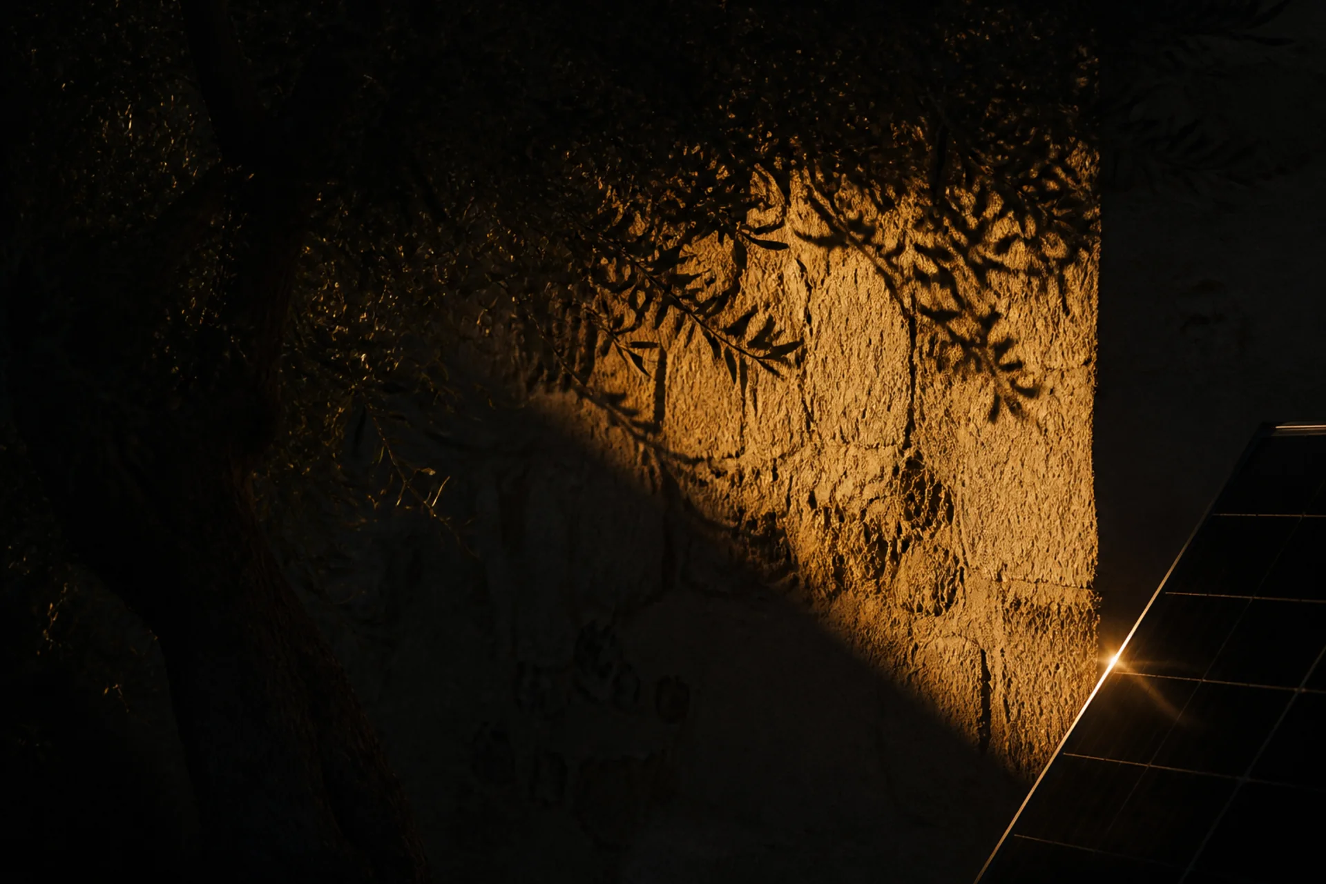
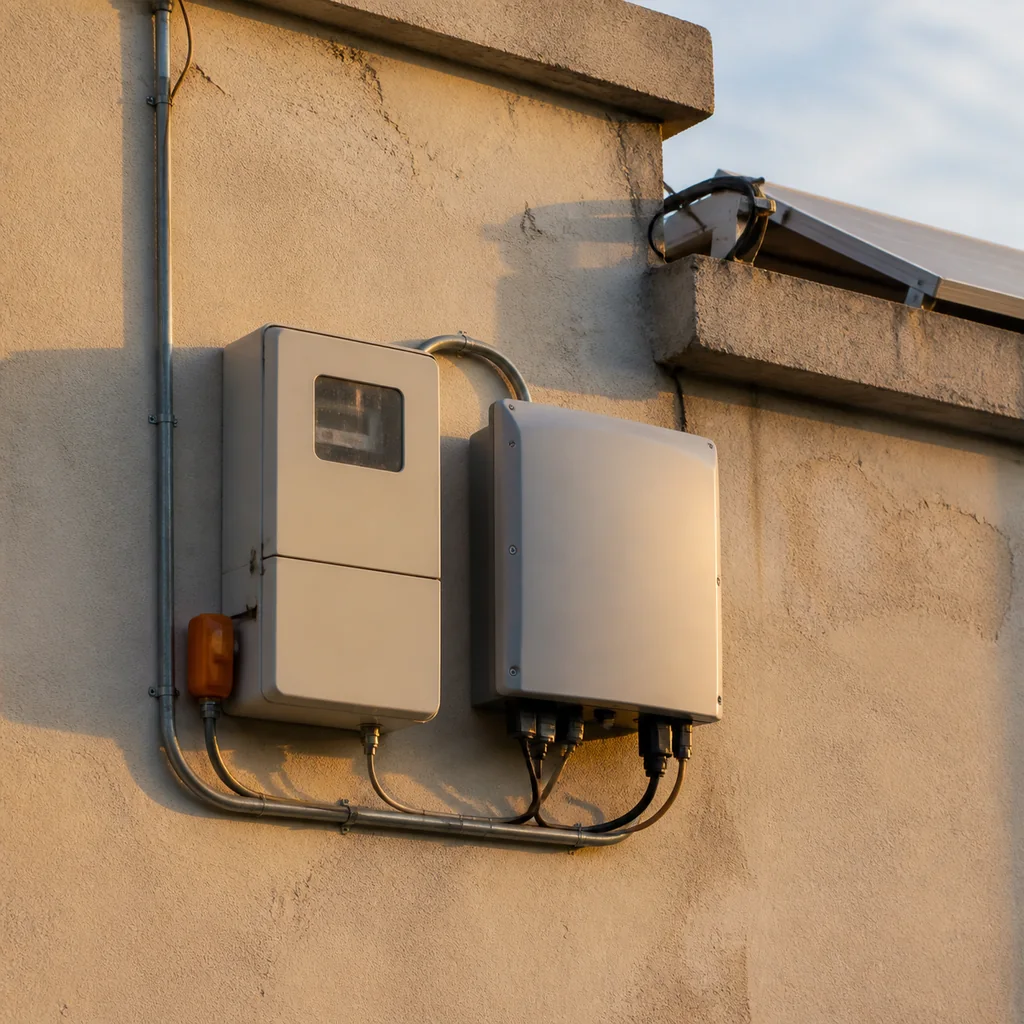
The subject is a Cyprus house, not an installation company. We hold no photographs of anybody’s completed work, and presenting stock images as such work would be a quiet fabrication.
What we photograph
- Ordinary houses: render or limestone walls, flat roofs with a parapet, a solar water heater beside the panels.
- Low light, within an hour of sunrise or sunset.
- Panels visible but not the hero of the frame.
- Whole houses in their street, so the scale is readable.
What we avoid
- Glossy villas from a property listing.
- Suburban gable roofs that belong to another country.
- Advertising skies and saturated blue.
- People, installer logos and number plates.